Sullivan Landing
Logo & Branding
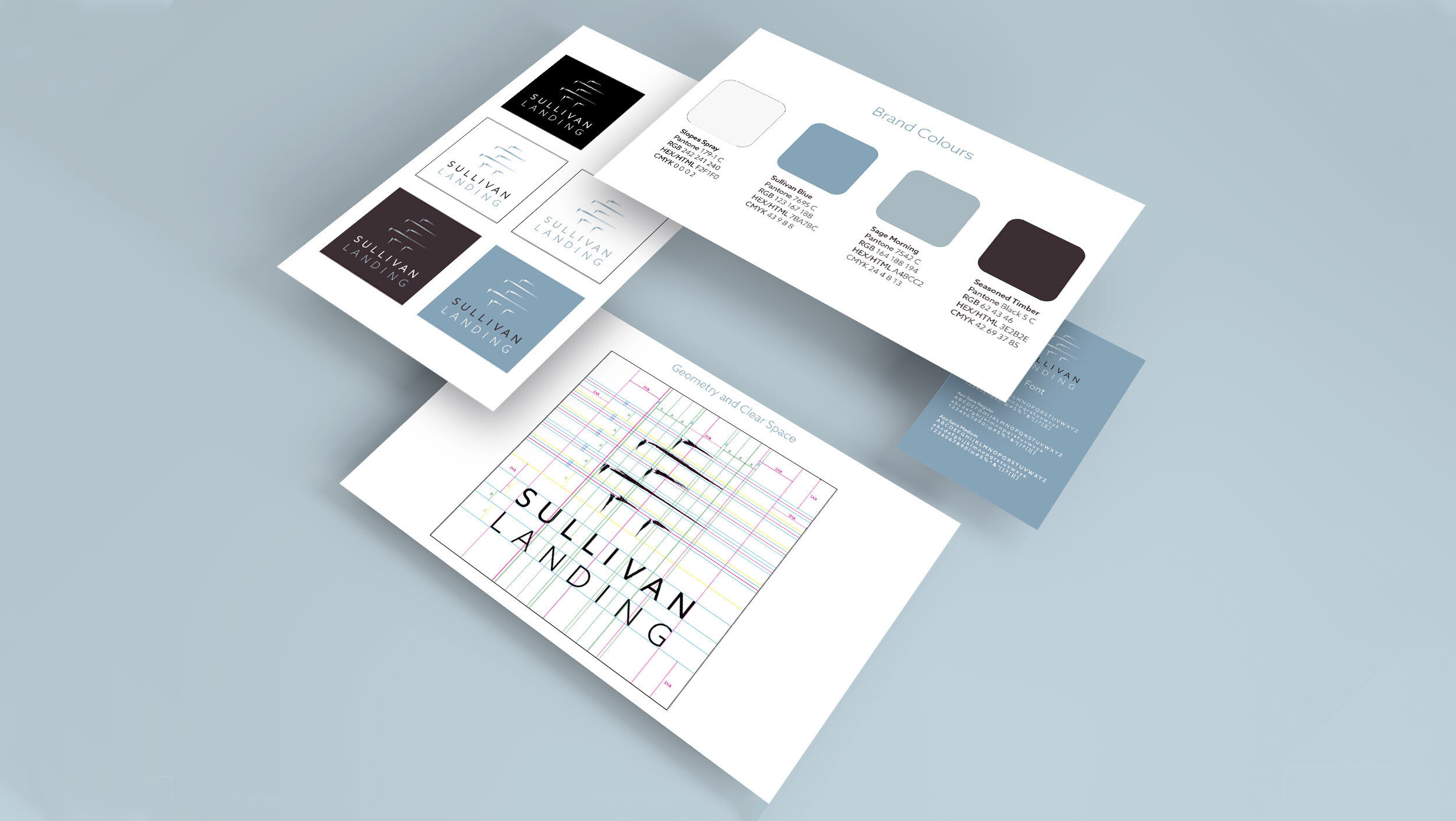
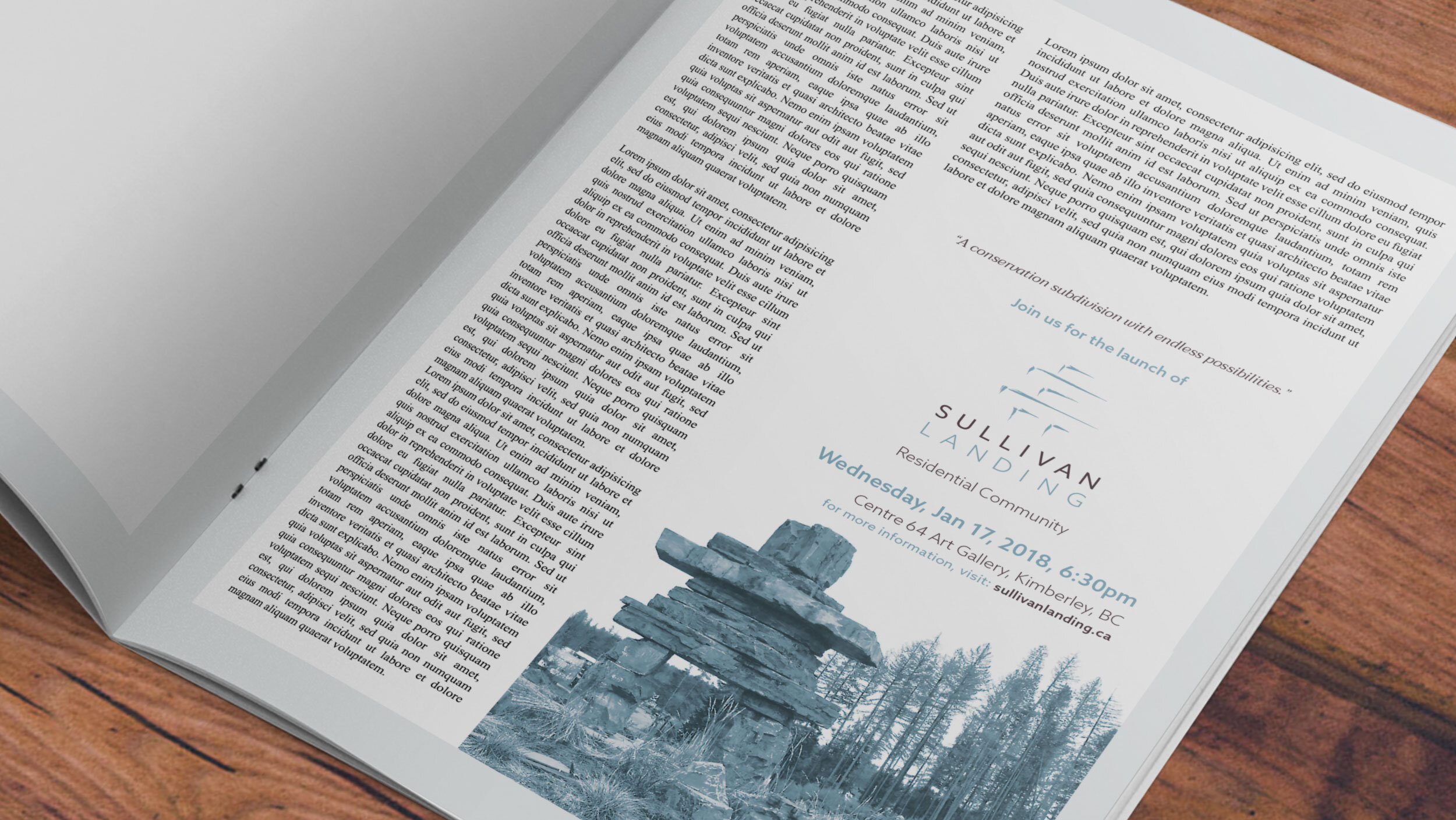
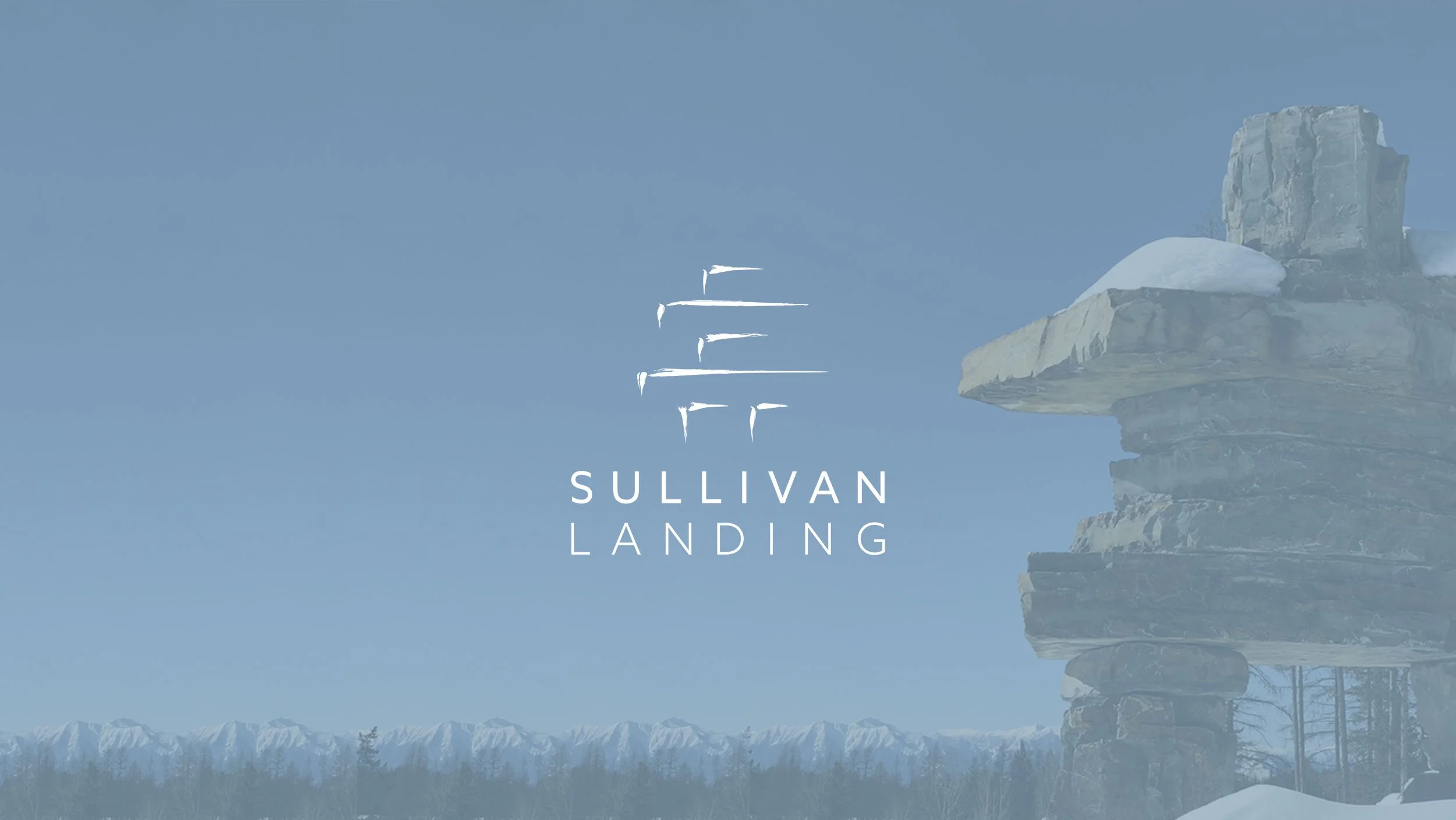
The community in Kimberley BC is situated in a picturesque valley, with a world class view of the neighbouring ski resort. Yet, the development had stalled and now had come under new leadership and developers. The new team needed a brand that would communicate to the area that this new sustainable community was in good hands. Sullivan Landing also would be the premier stage for the launching of a new innovative housing development company, LINQ. The message in the Sullivan Landing brand needed to give a sneak peak of what was to come from the new innovative housing development company, LINQ. A diminishing rustic brush stroke outlines the silhouette of an Inuksuk. The representation of the local landmark at the centre of the new development acts as a recognizable symbol to the area, while its depiction represents the elevated positioning of the new leadership. The LINQ identity would also evolve with a similar signature rustic brush stroke and slim contemporary aesthetic.

